『ART MAISON INTERNATIONAL Vol.27』
一昨日発行の国際美術書籍『ART MAISON INTERNATIONAL Vol.27』に私の作品が掲載されました。
この書籍は、ルーブル美術館/メトロポリタン美術館/大英博物館/プラド美術館/ウフィツィ美術館や日本の県立図書館等に寄贈されますので、見掛けたら是非お手に取ってご覧ください。
掲載にあたって、フランス芸術家協会(ル・サロン)絵画部門代表のアラン・バザールさんから評論をいただきました。
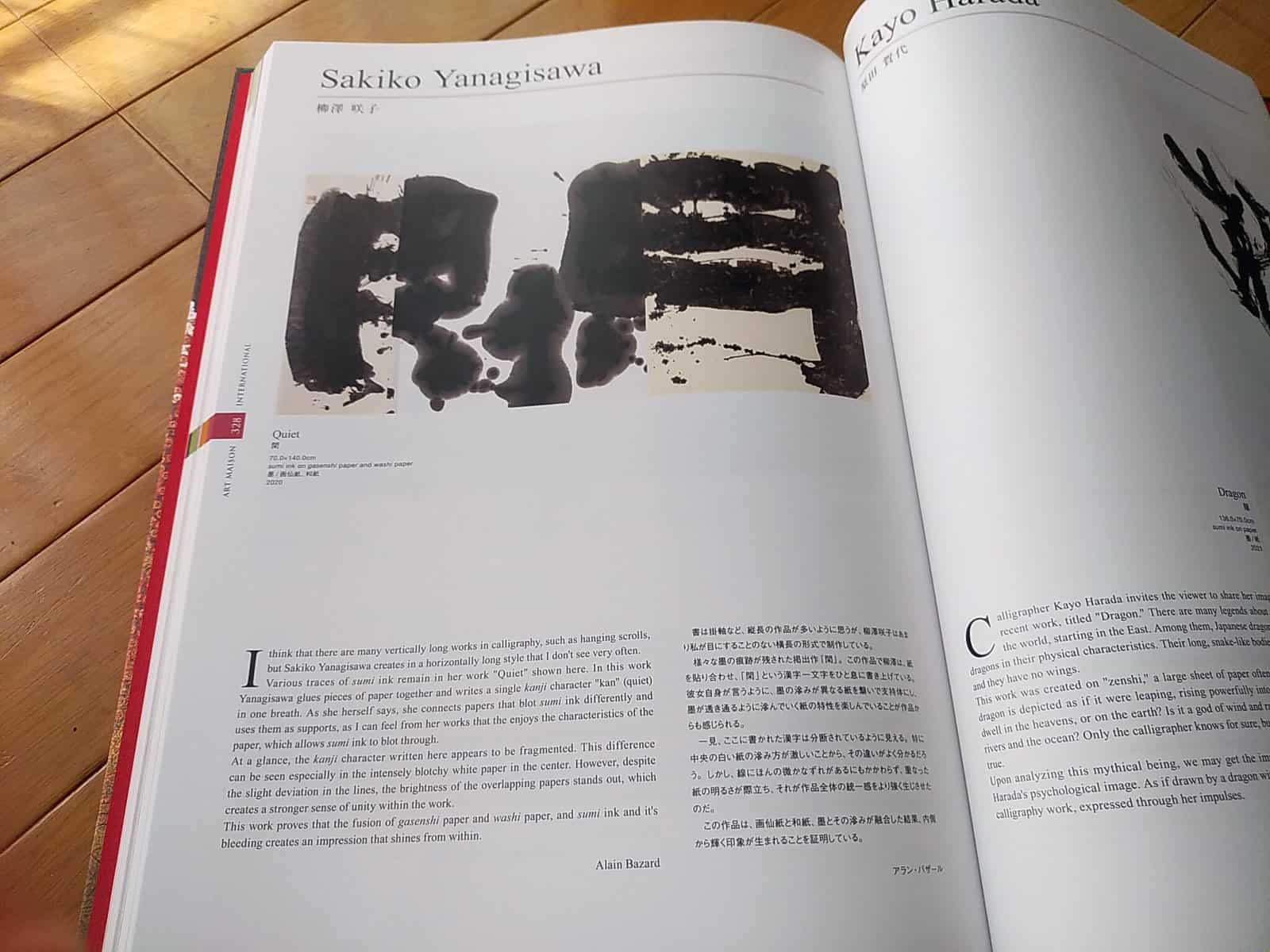
書は掛け軸など、縦長の作品が多いように思うが、柳澤咲子はあまり私が目にすることのない横長の形式で制作している。
様々な墨の痕跡が残された掲出作『閑』。この作品で柳澤は、紙を貼り合わせ、「閑」という漢字一文字をひと息に書き上げている。彼女自身が言うように、墨の滲みが異なる紙を繋いで支持体にし、墨が透き通るように滲んでいく紙の特性を楽しんでいることが作品からも感じられる。
一見、ここに書かれた漢字は分断されているように見える。特に中央の白い紙の滲み方が激しいことから、その違いがよく分かるだろう。しかし、線にほんの微かなずれがあるにもかかわらず、重なった紙の明るさが際立ち、それが作品全体の統一感をより強く生じさせたのだ。
この作品は、画仙紙と和紙、墨とその滲みが融合した結果、内側から輝く印象が生まれることを証明している。
I think that there are many vertically long works in calligraphy, such as hanging scrolls, but Sakiko Yanagisawa creates in a horizontally long style that I don’t see very often.
Various traces of sumi ink remain in her work “Quiet” shown here. In this work Yanagisawa glues pieces of paper together and writes a single kanji character “kan”(quiet) in one breath. As she herself says, she connects papers that blot sumi ink differently and uses them as supports, as I can feel from her works that the enjoys the characteristics of the paper, which allows sumi ink to blot through.
At a glance, the kanji character written here appears to fragmented. This difference can be seen especially in the intensely blotchy white paper in the center. However, despite the slight deviation in the lines, the brightness of the overlapping papers stands out, which creates a stronger sense of unity within the work.
This work proves that the fusion of gasenshi paper and washi paper, and sumi ink and it’s bleeding creates an impression that shines from within. Alain Bazard